title: Kindle Tips for Better Reading Skill date: 2023-01-22 tags: kindle english reading —
Kindle Tips for Better Reading Skill

-
Summarized from The Best Kindle Settings for Speed Reading
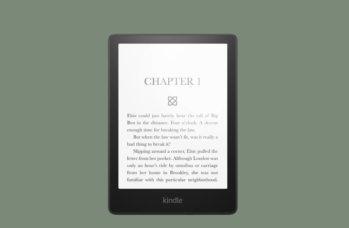
Use serifs font, not sans serif font
- This is because these details lead the reader’s eye from one letter to the next.
- The serifs will close the gap in the white space between letters.
- The little jumps our eyes do from one character to the next are reduced. This adds speed and reduces eye effort.
- Recommended fonts: Baskerville, Georgia, Palatino, Courier
Go landscape
- A vertical layout means shorter lines. Shorter lines result in more line jumping. This brings two problems
- Higher chances of jumping to the wrong line and then needing to backtrack or even re-start the entire paragraph.
- Increasing visual effort to jump from one line to the next, making your eyes tired faster.
- With longer lines, and fewer jumps, you will read faster and your eyes will be less tired
Use a marker
-
Markers are rectangular pieces of card familiar to readers of printed books. As the name denounces, they are useful to mark pages. But there is another way you can use them, and this time, even on Ebook readers.
-
Use your marker as a visual pacer, placing it just below the line that you are reading.
-
When you finish a line, move it down to reveal the next.
Reference
- The Best Kindle Settings for Speed Reading
- 4 Ways to Develop Life-Changing Skills at Home
- [[ How to Read Faster and Better ]]
- English Book Reading List
- 수준에 맞는 영어원서 고르기